The Main Forecast UI is being updated and soon you'll see a cleaner, more consistent experience across the app. The changes are subtle, but they'll make your day-to-day flow just a little more seamless.
Here's what you'll notice when the update rolls out:
-
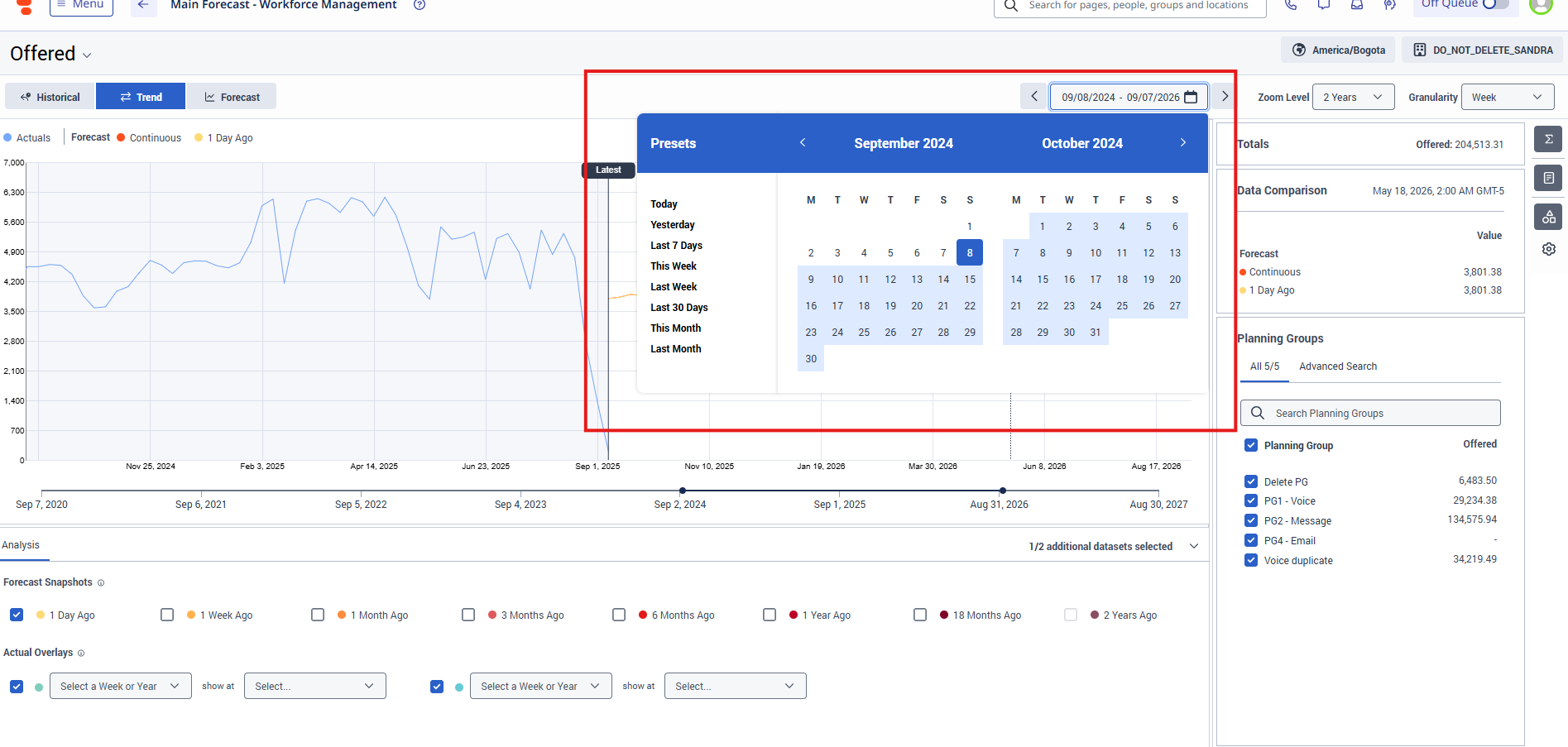
Date picker: Bigger with extra breathing room in the header.
-
Buttons: Softer, lighter colors for both normal and hover states.
-
Dropdowns: More color cues when you hover or make a selection.
-
Tooltips: A tidier look with improved positioning and formatting.
-
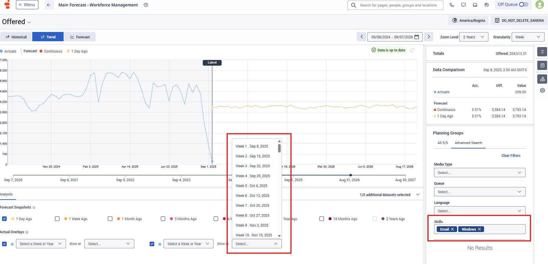
Skills tag selector: Updated tag sizes and colors for a sleeker feel.
-
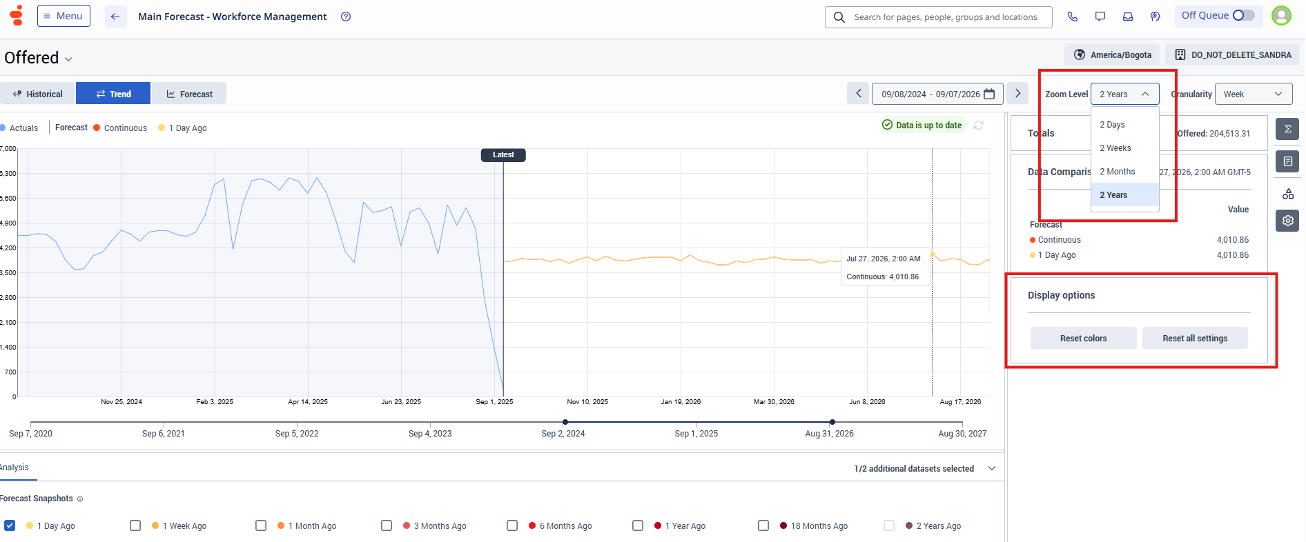
Overall tweaks: Small adjustments to spacing and sizing across the page for a more consistent experience.
The best part? These refinements won't disrupt your workflow-just make it a little smoother and more polished.
-----------------------------------------------------------------------------------------------------------------------------------------------------------------------------------------
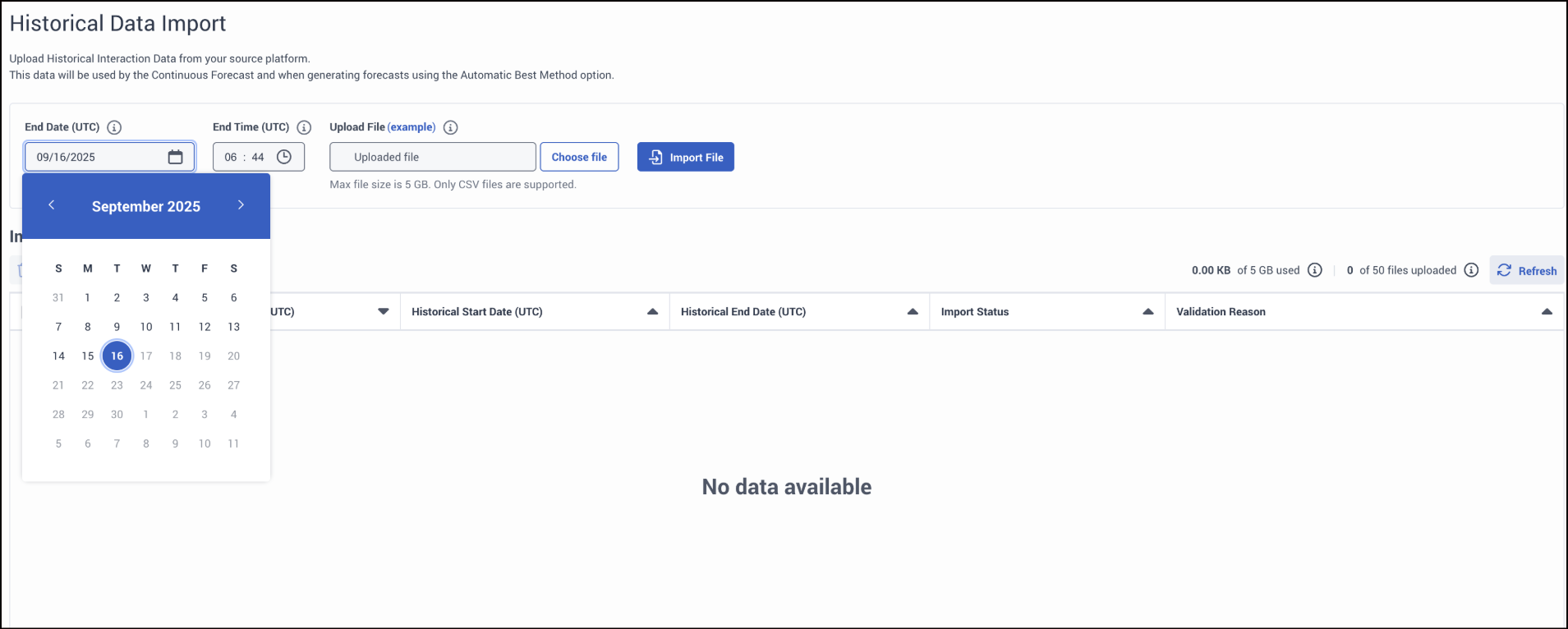
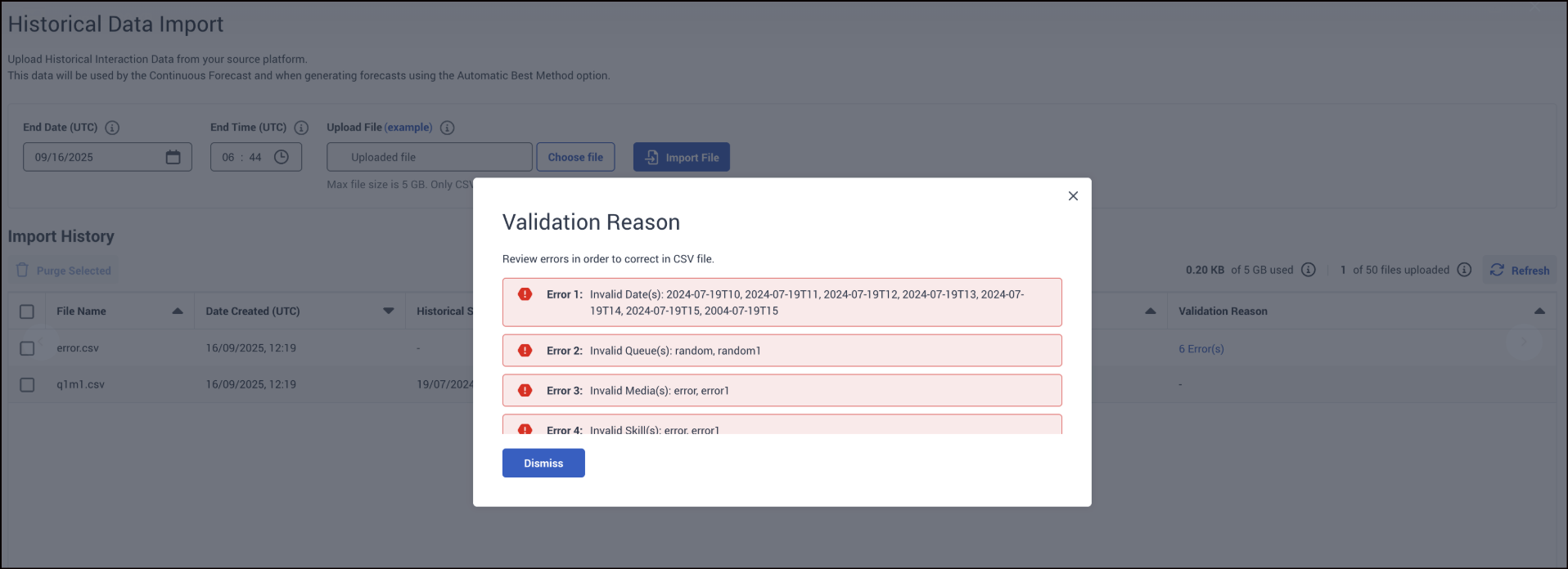
Updates to HDI
We’ve made a series of visual and functional updates to improve clarity, consistency, and usability on the Historical Data Import page. These changes focus on button styles, modals, banners, and table navigation to ensure a cleaner and more intuitive user experience.
Buttons & Labels
-
“Purge selected” button color updated to blue
-
“Refresh” button color updated to blue
-
“No data available” message is now larger and bold for visibility
Table & Calendar
-
Table pagination redesigned for smoother navigation
-
Selected date in calendar now shown in a circle
-
Time dropdown now displays with 0-padding (e.g., 09:00 instead of 9:00)
Modal Updates
-
Modal size adjusted for consistency
-
Close button moved to the left side
-
Close button colors updated for better visibility
Banner & Error Handling
-
Error banner text is now black for readability
-
Error icon updated to solid red
-
Info banner color changed to blue
#Forecasting
------------------------------
Pavithra Asokan
Senior Product Manager, WEM
------------------------------