Hi everyone,
As you may or may not know, we're planning to introduce the ability for you to change the color of your Activities within Workforce Management (WFM). As part of that work, we're reviewing how selected activities should appear within the Schedule Editor to ensure the experience stays clear, accessible, and reliable - especially once you can choose any colors you like.
Why this matters
Today, the Schedule Editor shows a selected activity by darkening the color slightly. This works well with our current, fixed color palette, but as we move toward full customization, some issues begin to emerge.
For example:
If a Scheduler chooses several similar shades of blue for different On Queue activities, it's possible that the selected-state color - darkened from its original state - ends up looking identical to another activity. In these cases it can become harder to immediately see what's selected, and we want to make sure this doesn't cause any problems for you as you work through schedules.
Since many of you rely on rapid visual scanning - with dozens or even hundreds of activities configured - we want to ensure selections always stand out clearly, regardless of the colors you choose.
Our proposed solution
As part of enabling full color customization, we're also updating how selected activities appear in the Schedule Editor. Because you'll soon be able to choose any color, the current approach (which only darkens selected items and is based on hard-coded colors) won't always provide enough contrast.
To address this, we are introducing a new selected-state behavior:
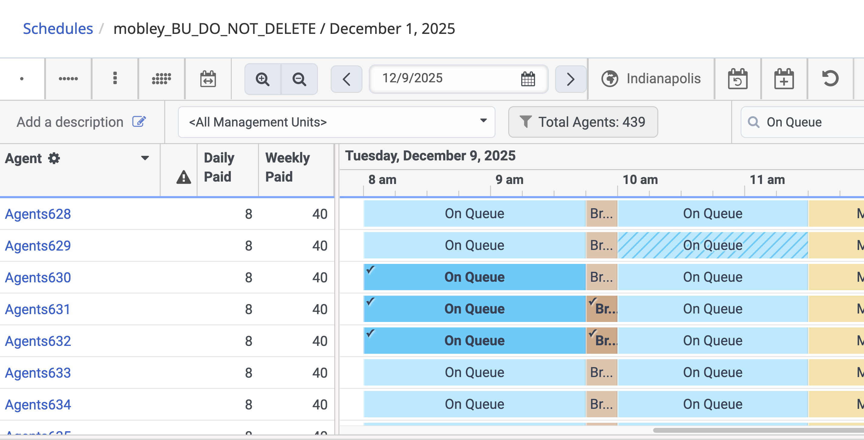
The selected activity will be automatically lightened or darkened based on luminance
This ensures that the selected state remains visually distinct and accessible no matter which colors you configure.
A small checkmark will appear in the top-left corner of any selected activity
This provides a consistent, unmistakable visual cue - especially helpful when several activities share similar color tones, or when the luminance-based adjustment results in a shade close to others in your schedule.
Here is what the selection checkmark can look like:
The checkmark will appear only when an activity is selected, working alongside the updated color adjustment.
What we want to validate with you
We'd love your feedback on this approach:
- Would this checkmark + color-shift combination solve the visibility issues for you?
- Does it give you confidence that selections will always remain clear - even with heavily customized color palettes?
- Is the checkmark noticeable enough in your day-to-day scheduling workflow?
- Should it be larger, differently positioned, or styled differently?
- If this doesn't fully solve the problem, what alternatives would you prefer?
- A border? A glow? A pattern overlay? Something else?
Why your input matters
This feature touches one of the most visually dense and high-use areas of WFM. Your feedback will directly influence how we deliver custom color support while still ensuring:
- Accessibility
- Clarity under all color choices
- Fast, confident interactions for Schedulers
Please let us know what you think - your insights shape how we design this.
Looking forward to your feedback!
#ScheduleManagement#WFMConfiguration,BestPractices#GeneralQuestion------------------------------
Andy Boland
Product Manager
------------------------------