Hi - we are committed to ensuring our products meeting WCAG Level AA: this is a design choice, to ultimately build better products.
This upcoming change was announced last year, see this other post: https://community.genesys.com/discussion/accessibility-wcag-aa-improved-color-contrast-for-messenger. The choice of text color is auto-determined in order to meet minimum contrast ratio, and we do not allow brands to alter this.
------------------------------
Angelo Cicchitto
Genesys - Employees
------------------------------
Original Message:
Sent: 01-09-2024 19:09
From: Ryan Cheesman
Subject: Web Messaging Color Scheme Accessibility Scheme - Undo
Thanks.
I found that using the color picker, that just barley a darker shade of blue did the trick. The problem is that it doesn't comply with our branding, so I am having to use a really dark blue option we have. What I don't get is that the standard is optional, not a requirement, so why not offer customers some flexibility to override it?
I appreciate your response Anton.
|  | Ryan Cheesman SR. MANAGER, IT INTEGRATION SERVICES P + 858.366.6944 C + 760.310.2532 Tandem Diabetes Care | positively different 12400 High Bluff Dr. San Diego CA 92130 tandemdiabetes.com The information in this email (including any attachments) may be privileged and/or confidential and is intended only for the recipient(s) listed above. Any use, disclosure, distribution, or copying of this email is prohibited except by or on behalf of the intended recipient. If you have received this email in error, please notify me immediately and destroy all copies of the transmittal. Thank you. |
Original Message:
Sent: 1/9/2024 3:21:00 PM
From: Anton Vroon
Subject: RE: Web Messaging Color Scheme Accessibility Scheme - Undo
Only way to change it is to increase the darkness of the blue you use
To conform to the standards they have for minimum colour contrast (4:5:1) requires this to be automatic
Here is a W3 article around why that ratio is generally used throughout web design - https://www.w3.org/TR/UNDERSTANDING-WCAG20/visual-audio-contrast-contrast.html#:~:text=The%204.5%3A1%20ratio%20is,sensitivity%20that%20typically%20accompanies%20aging.
Even in the example that Genesys gave on announcing the change I personally preferred the before which looked nicer, but its more about what is accessible for more people rather than what looks nicer for even most people.
Edit: Check out this idea, which might support what you are after: https://genesyscloud.ideas.aha.io/ideas/DXWMM-I-136
------------------------------
Anton Vroon
Original Message:
Sent: 01-09-2024 14:19
From: Ryan Cheesman
Subject: Web Messaging Color Scheme Accessibility Scheme - Undo
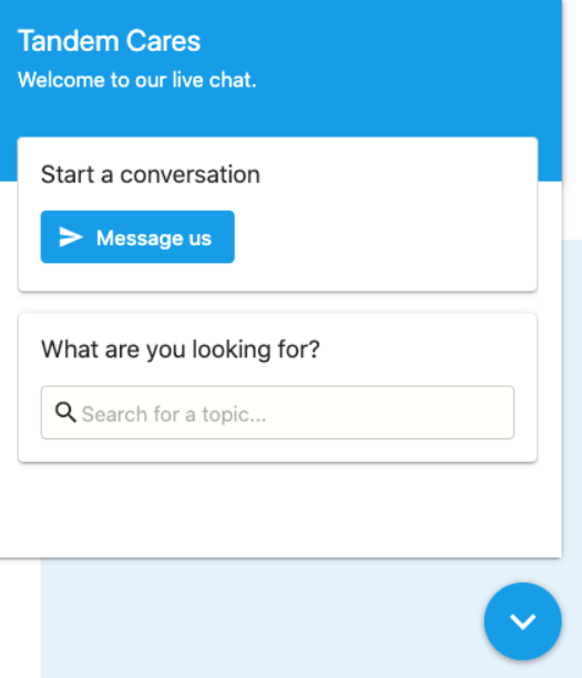
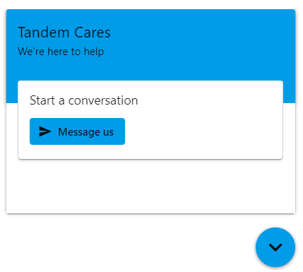
Was wondering if anyone could help me figure out how to switch the text color back to white in our Web Messaging config. The last Accessibility Web Messaging update that came out a back sometime between August and October changed the look of our Web Messaging widget. The chat button when from custom html color as the background with white text to custom color with black in the background. This affected all of the text within, and it looks terrible. Is there any way around this, or what is the new design "best practice" we should follow? I would think that our white on blue would meet the contrast requirements, but reading the accessibility pages in resource center just tells me that they tested and met the requirement, not how to actually configure our web messaging to comply, etc. Is it possible to go back to White on Blue from Black on Blue?
BEFORE:

AFTER:


#DigitalChannels
------------------------------
Ryan Cheesman
Senior Manager, IT Integration Services
Tandem Diabetes Care Inc. | positively different
------------------------------