Is it just me? Or is the new status colour scheme for On-Queue is a poor choice?
Replacing the previous sky blue colour, the On-Queue status is now using a darker blue .
This colour (R:33 G67: B162 or HEX/HTML #2143a2) also happens to be the same blue colour being used across the rest of the Genesys Cloud user interface including:
- text
- toggles
- buttons
- hover text/links

Previously it was clear and simple - sky blue = on queue. The distinctive lighter blue colour was immediately obvious it's related to the On Queue status.
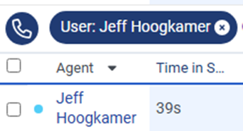
Now the On-Queue status blends into the rest of the desktop and there is no longer a clear, simple visual colour indicator of when someone is in the On-Queue status.
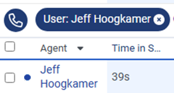
It's even less obvious at a quick glance if:
- does the blue mean the On-Queue status/colour? or
- is it just a UI element that is not releated to status?
It's even worse on dark-mode dashboards, the new blue colour just barely stands out anymore and is very hard to see.

All the Status colours were apparently changed to 'improve accessibility' - I can't imagine how the new dark blue • status colour is more accessible than the sky blue • status colour?
Genesys - please re-consider using the previous sky blue for On Queue status.
Or even better, give us the option to toggle for 'Easy Visibility' vs 'Accessibility' colours.
Otherwise, at least make it a blue that works in both dark mode and light modes that isn't part of the general UI colour scheme.
I've raised an idea https://genesyscloud.ideas.aha.io/ideas/EPUS-I-226 if you feel the same way and wish to vote on it.
#MakeOnQueueSkyBlueAgain
#Omni-ChannelDesktop/UserInterface------------------------------
Jeff
------------------------------