thanks for bringing the resource center article to our attention. I've asked our documentation team to look into it. We are constantly improving our process. Could you elaborate how these changes have impacted your users?
Roster layout and icon explanation is in the video clip within this resource center article
Original Message:
Sent: 03-23-2022 20:08
From: Jeff Hoogkamer
Subject: On Queue/Off Queue toggle changed appearance?
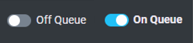
What's even worse - when you're Off Queue, it highlights the slider with a light blue border and keeps it highlighted until you click something else in Genesys Cloud. So it just looks like you're On Queue when you're not.

I think it's the risk that gets taken with an 'Agile' approach to product development and releases - it's very easy to get caught up in releasing something quickly and forgetting the whole change management piece.
Like with the changes to the Agent roster - what do the new icons mean and new layout mean?


The Resource Center has no information and hasn't been updated since PureCloud
Icons in the inbox have changed - and all documentation is still showing old icons in Resource Center.

Original Message:
Sent: 03-23-2022 01:34
From: Vaun McCarthy
Subject: On Queue/Off Queue toggle changed appearance?
How does this stuff get released without any type of notification or at the very least, was it QA'd? That Callback button in particular is quite frustrating as I only just put together a guide for a customer with screenshots taking just before this changed.
------------------------------
Vaun McCarthy
Original Message:
Sent: 03-23-2022 00:56
From: Jeffrey Hoogkamer
Subject: On Queue/Off Queue toggle changed appearance?
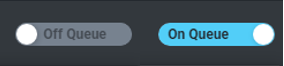
Can confirm the same here with the slider.
The original slider was very prominent and clear when a user was On Queue vs Off Queue - it was very easy to tell in peripheral vision if you were still On Queue or not.
Now it requires direct attention - and it's even less obvious now using a darker blue toggle (and not the same 'blue on queue' colour)
Original Message:
Sent: 03-22-2022 18:51
From: Gareth James
Subject: On Queue/Off Queue toggle changed appearance?
Interestingly the button design seems to have changed again, with a darker blue being used and a tick now when On Queue

In addition we do have the really poor End Callback, which as you say is pretty much unreadable

------------------------------
Gareth James
CALLSCAN AUSTRALIA PTY. LTD.
Original Message:
Sent: 03-22-2022 12:51
From: Eric Loison
Subject: On Queue/Off Queue toggle changed appearance?
We noticed this as well. And the feedback from users is not good, they much prefer the older version of the switch. Was it shortened by mistake -since it was not announced- or is this done by design? They also noticed the [End callback] button's text is now grey on a blue background when it used to be white and is pretty much unreadable.
(photo attached). Do you also have that issue?
------------------------------
Eric Loison
Foehn Ltd.
Original Message:
Sent: 03-18-2022 00:53
From: Jeffrey Hoogkamer
Subject: On Queue/Off Queue toggle changed appearance?
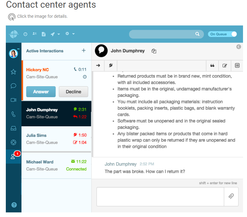
Hi All,
During mid-shift during the day, it appears the On Queue / Off Queue toggle changed appearance:
Original:
New:
At the same time this occurred - a consultant was showing blue 'On Queue' in their interface, but in the Queues Activity they were green Available. It wasn't until they refreshed that it correctly showed them Off Queue.
This weeks Release Notes (March 16, 2022) didn't have anything mentioned about this change, and the Resource Center still has the Original version pictured (in the aqua/blue 'PureCloud' version/colour).
Has anyone else noticed this (we are in APSE2 region) and have any issues?
#Omni-ChannelDesktop/UserInterface